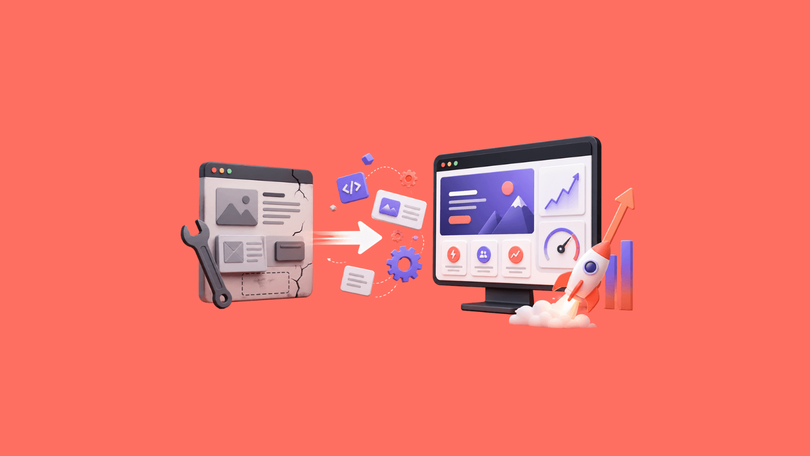
How We Migrated Our Agency Website From WordPress to Next.js
We built great sites for clients while our own sat broken. Here's how we fixed it in 4 weeks.
G
Georgiana Nutas
·16 min read
We're a web development agency. Our own website was our worst portfolio piece.
That sentence should sting if you run an agency. It stung us. For years, BluDeskSoft built polished, high-performing websites for clients while our own site sat on WordPress with Elementor, running on shared hosting, collecting technical debt like it was a hobby.
The site wasn't broken in the way that makes you panic. It loaded. It had pages. It even scored 95 on desktop performance in Lighthouse. If you glanced at the homepage, you might think everything was fine.
But we knew better.
THE COBBLER'S SHOES
Every agency has a version of this story. You're so busy delivering for clients that your own presence becomes the thing you never prioritize. "We'll fix it next sprint." That sprint never comes.
For us, the problem wasn't one dramatic failure. It was a slow accumulation of neglect that, when we finally cataloged it, painted a picture no agency would want a prospect to see.
Here's what we found when we actually audited our own site:
The blog listing page had "- Copy" in the title tag. Someone had duplicated a page in WordPress, never renamed it, and it had been live like that for months. This was the page we expected to rank for our content.
The homepage H1 tag reads "Success Starts Here Web Excellence." No punctuation. No line break. Elementor had a visual line break that looked fine in the builder but output a single unbroken string in the actual HTML. Our main heading, the single most important piece of on-page SEO, was gibberish to a search engine.
Zero Open Graph tags across the entire site. Every single page. When someone shared a link to BluDeskSoft on LinkedIn or Twitter, the preview card showed nothing useful. For a web development agency, this is the equivalent of a dentist with visible cavities.
About 80% of pages had no canonical URL. Search engines were left guessing which version of each page was authoritative.
The meta description on our services page was roughly 300 characters of conversational rambling. Google truncates at around 155-160. Half of our description was invisible in search results, and what was visible read like someone thinking out loud rather than writing deliberately.
Our project pages, the work we were supposed to be showcasing, were thumbnails and names. No descriptions. No challenges explained. No results demonstrated. A prospective client who visited those pages learned nothing about what we do or how we think.
The contact page had duplicate H1 tags. Two of them. On the same page.
A test page at /en/gallery-test/ was indexed and sitting in our sitemap. Someone had created it during development and never cleaned it up.
Author pages displayed "georgiana" in lowercase, with no H1 tag at all.
Two separate pages had "Ask us, it's free!" stuffed into the title tag — a promotional phrase that belongs in body copy, not metadata.
Blog posts #3 and #4 had their content swapped with each other's URLs. The articles were published under the wrong addresses.
And /en/category/uncategorized/ was indexed. The default WordPress category, the one that exists because WordPress requires at least one category, was being served to search engines as if it were real content.
The site was also bilingual in English and Romanian, but the Romanian content was poorly maintained and inconsistently translated. We were serving two half-quality versions instead of one good one.
None of these issues is exotic. Every one of them is a standard WordPress housekeeping task. That was the uncomfortable part. These weren't hard problems. They were neglected ones.
THE BREAKING POINT
There was no single dramatic moment that triggered the rebuild. No catastrophic downtime. No client who pointed at our site and laughed.
It was a slow realization during a client pitch. We were walking a prospect through our process for performance optimization, semantic HTML, and SEO best practices. Showing slides. Talking about Core Web Vitals. And somewhere in the back of our minds, we knew that if this person spent ten minutes on our site with any technical eye, they'd find half a dozen contradictions to everything we were saying.
That dissonance between what we sold and what we showed became impossible to ignore.
We set a hard deadline: four weeks from start to launch.
WHY WE LEFT WORDPRESS
This isn't an anti-WordPress article. WordPress powers over 40% of the web, and it does so well. For many businesses, it's the right choice.
But for us, a development agency that builds custom applications, WordPress with Elementor was the wrong tool. Here's why.
We needed our website to demonstrate our capabilities. A page-builder theme on shared hosting demonstrated the opposite. Every time we sent a prospect to our site, we were implicitly saying, "We build custom solutions, but we didn't bother building one for ourselves."
We also needed performance that wasn't reliant on caching plugins and optimization add-ons. WordPress can be fast, but making it fast requires ongoing maintenance of a plugin stack that adds its own complexity. We wanted performance to be a default, not a maintenance task.
And we needed a development workflow that matched how we actually work: Git-based version control, preview deployments, TypeScript, component-based architecture. The kind of workflow we use for every client project, but we weren't using it for our own site.
We chose Next.js 16 as the framework, Payload CMS 3.x for blog content management, Supabase as the database layer, Tailwind v4 with shadcn/ui for the design system, Resend for transactional email, and Vercel for deployment.
If you want the technical reasoning behind each choice, we cover that in detail in our companion post. The short version: every tool had to earn its place. No resume-driven development. No hype chasing.
One architectural decision worth highlighting here: we made Payload CMS responsible only for blog posts. Everything else — services, projects, company information, team details — lives in TypeScript data files, hardcoded and version-controlled. If content rarely changes, it doesn't need a CMS. This kept our architecture simple and our content reliable.
We also made a deliberate cut: the new site would be English only. Our bilingual setup was half-broken and diluting the quality of both versions. Better to ship one polished language than two mediocre ones. Romanian could come back later, done properly, or not at all.
THE PLAN
Four weeks. Hard deadline. No extensions.
We broke the build into four phases:
Week 1 — Foundation. Infrastructure setup, Payload CMS configuration, Supabase schema design, authentication, and the basic application skeleton.
Week 2 — Core pages and design system. Homepage, services, projects, contact, support. Build the component library. Establish the visual language.
Week 3 — Content migration and case studies. Move 71 blog posts from WordPress to Payload. Write project case studies from scratch for LintPage, Stampello, and the Optometry Office CRM.
Week 4 — SEO, performance, and launch. Open Graph tags, canonical URLs, structured data, sitemap, robots.txt, redirects, Lighthouse audits, cross-browser testing, and deployment.
We used AI-assisted coding throughout the build, specifically Claude, to accelerate development. This wasn't about replacing our judgment — it was about compressing the tedious parts so we could focus on decisions that required experience. Component scaffolding, data transformation, migration scripts, and boilerplate generation. The kind of work that takes time but not thought.
That choice was a significant factor in making a four-week timeline realistic at all.
WEEK 1: LAYING THE GROUNDWORK
The first week was less glamorous than it sounds. Infrastructure work rarely is.
We set up the Next.js 16 project, configured Payload CMS to run inside the same application (one deployment, not two), and designed the Supabase schema. A key decision here: Payload runs in its own dedicated database schema, completely separated from any public-facing tables. This meant Payload's internal tables never interfered with Row Level Security policies on the rest of the database. Clean separation from day one.
We configured Vercel deployments, set up environment variables, established a Git workflow with preview URLs for every branch, and enabled authentication.
By the end of week one, we had a running application that didn't look like much but had solid bones. The kind of week where the progress is invisible to anyone who isn't reading the codebase.
WEEK 2: BUILDING THE FACE
Week two was when the site started to become real. We built the homepage, services page, project pages, contact form, and support page. Each one is designed from scratch, not adapted from a template.
The design system came together through Tailwind v4 and shadcn/ui. Shadcn's model — a copy-paste approach using components you own and modify — suited us perfectly. No dependency on someone else's component library. No fighting an opinionated framework to get the look we wanted. We pulled in primitives and made them ours.
The project pages were a specific point of pride. Remember, the old site had thumbnails and names. Nothing else. The new project pages for LintPage, Stampello, and the Optometry Office CRM would tell real stories: what the client needed, what we built, the challenges we solved, and the results that followed.
But we hadn't written those stories yet. That was week three's problem.
By the end of week two, the core pages were built and responsive. The design system was established. You could navigate the site, and it felt like a real product. Still no content on the blog or case study copy, but the structure was there.
WEEK 3: THE HARD PART
We expected week three to be the week of the blog migration. Move 71 posts from WordPress to Payload, clean up formatting, fix image references, and update metadata. Technically involved but conceptually straightforward.
The blog migration was, in fact, the easier part. We used AI assistance to transform the content — extracting metadata, reformatting HTML to match our new components, and cleaning up image references. What we'd estimated at two weeks compressed into days. The transformation was mechanical, and mechanical work is exactly where AI tooling shines.
The hard part was the case studies.
Writing about your own work is a different kind of difficult. You know too much. Every project has hundreds of details, and deciding which ones matter to someone who wasn't there requires a clarity of thought that coding doesn't demand.
For each of our three projects — LintPage (an SEO auditing tool), Stampello (a digital loyalty platform), and the Optometry Office CRM — we had to answer questions we'd been avoiding. What was the actual problem? What was our approach, and why? What were the results? What would we do differently?
Describing what you built is easy. Explaining why it mattered is hard.
We spent more time writing the three case study pages than we spent on the entire blog migration. And honestly, the copy still isn't where we want it. Telling your own story well is an iterative process, and we're still iterating.
The lesson here was humbling. We tell clients all the time that content is the hardest part of any website project. Week three was a reminder that we're not exempt from our own advice.
WEEK 4: THE POLISH
Week four was about fixing everything the old site got wrong and making sure the new site got it right.
Open Graph tags on every page. Proper og:title, og:description, og:image, og:url. When someone shares a BluDeskSoft link now, the preview card actually shows something useful.
Canonical URLs on every page. No ambiguity about which version is authoritative.
Clean, concise meta descriptions — under 160 characters, written deliberately, one per page.
Proper heading hierarchy. One H1 per page. Semantic HTML throughout. No more Elementor artifacts creating gibberish in the document outline.
A sitemap with only real pages. No test pages. No uncategorized archives. No gallery-test leftovers.
Structured data where it mattered. Proper author information on blog posts. No more lowercase "georgiana" floating in the void.
And then the performance work. Server-side rendering. Optimized image delivery through Vercel. Proper font loading. Minimal JavaScript shipped to the client. The kind of performance that comes from the architecture itself, not from bolting on optimization plugins after the fact.
We ran Lighthouse on every key page, documented the scores, and compared them to the old site.
Then we launched.
THE RESULTS
Here are the real numbers. Every score is from Google Lighthouse, run on the same pages, before and after the migration. We're showing all four categories: Performance, Accessibility, Best Practices, and SEO.
Desktop scores (Old -> New):
Homepage:
Performance: 95 -> 100
Accessibility: 83 -> 100
Best Practices: 100 -> 100
SEO: 100 -> 100
Services:
Performance: 95 -> 100
Accessibility: 84 -> 97
Best Practices: 100 -> 100
SEO: 92 -> 100
Blog listing:
Performance: 95 -> 99
Accessibility: 83 -> 97
Best Practices: 100 -> 100
SEO: 92 -> 100
Blog post:
Performance: 95 -> 99
Accessibility: 78 -> 100
Best Practices: 100 -> 100
SEO: 100 -> 100
Contact:
Performance: 95 -> 100
Accessibility: 84 -> 100
Best Practices: 100 -> 100
SEO: 100 -> 100
Support:
Performance: 93 -> 99
Accessibility: 84 -> 100
Best Practices: 100 -> 100
SEO: 92 -> 100
Mobile scores (Old -> New):
Homepage:
Performance: 80 -> 98
Accessibility: 82 -> 100
Best Practices: 100 -> 100
SEO: 100 -> 100
Services:
Performance: 79 -> 99
Accessibility: 81 -> 97
Best Practices: 100 -> 100
SEO: 92 -> 100
Blog listing:
Performance: 80 -> 93
Accessibility: 82 -> 97
Best Practices: 100 -> 100
SEO: 92 -> 100
Blog post:
Performance: 68 -> 97
Accessibility: 77 -> 100
Best Practices: 100 -> 100
SEO: 100 -> 100
Contact:
Performance: 85 -> 97
Accessibility: 83 -> 100
Best Practices: 100 -> 100
SEO: 100 -> 100
Support:
Performance: 84 -> 100
Accessibility: 81 -> 100
Best Practices: 100 -> 100
SEO: 92 -> 100
The key improvements:
Mobile performance average: ~79 -> ~97. That's a 23% improvement.
Accessibility average: ~82 -> ~99. A 21% improvement.
Biggest single jump: blog post on mobile, from 68 to 97. A 43% improvement.
SEO scores: from a mix of 92s and 100s to straight 100s on every page.
The old desktop scores looked respectable. A 95 in performance sounds great in a report. But desktop scores can mask real problems. The mobile story was different, and mobile is where most web traffic actually happens.
The accessibility gains matter more than the performance ones, frankly. Going from the low 80s to near-perfect scores means the site works better for screen readers, keyboard navigation, and users with visual impairments. That wasn't a side effect of the new stack. It was a deliberate priority: semantic HTML, proper ARIA attributes, sufficient color contrast, logical heading hierarchy.
Beyond the Lighthouse numbers, the qualitative improvements are just as significant:
Every page now has proper Open Graph tags. Social sharing actually works.
Every page has a canonical URL. No more search engine confusion.
Meta descriptions are deliberate, concise, and useful. Not 300-character monologues.
Project pages tell real stories with context, challenges, and outcomes.
The blog works. No "- Copy" in titles. No swapped content. No indexed test pages or uncategorized archives.
Content management is simpler. Blog posts go through Payload CMS. Everything else is in version-controlled TypeScript files that are deployed via Git. No plugin updates to worry about. No database backups to manage separately from code.
And the development workflow now matches what we use for client work: pull request previews on Vercel, TypeScript type safety, component-based architecture, and a codebase we're proud to point to as an example of how we build.
WHAT WE'D DO DIFFERENTLY
No honest case study skips this part.
We would start the case study writing earlier. Pushing it to week three and treating it as a "content task" underestimated the difficulty. Writing about your own work requires deep thought, multiple drafts, and ideally feedback from someone outside the project. We should have started outlining case studies in week one and refined them throughout the build.
We would set up analytics from day one, not day twenty-five. We launched with analytics in place, but we lost the ability to do a clean comparison of traffic patterns during the transition period. Having baseline measurements running before the switch would have given us better data for this case study.
We would be less precious about the design system early on. We spent time in week two getting component details right, only to change them later anyway. For a four-week build, it's better to move fast with rough components and refine once the full picture is visible.
We would document our WordPress site more thoroughly before tearing it down. Screenshots, full crawl exports, and content inventory. We did some of this, but not as systematically as we should have. Once the old site is gone, you can't go back and check what you forgot to record.
WHAT'S NEXT
The site is live, but it's not finished. A website is never finished.
On our roadmap: deeper case studies for each project. The current pages are a clear improvement over thumbnails-and-names, but there's room to go further. We want to show process, not just outcomes.
We're exploring whether to bring back Romanian as a second language, done properly this time with a real internationalization setup rather than a bolted-on translation plugin. If it comes back, it will be because we can maintain it at the same quality as the English version.
Dark mode is on the list. We left it out of the initial build to reduce scope, but it's a user preference worth supporting, and one more chance to show we practice what we preach about accessible design.
And we're continuing to publish content, both blog posts through Payload CMS and this case study series documenting the migration. The companion technical post covers the architecture decisions in depth for developers and technical readers.
THE REAL TAKEAWAY
If you run an agency and your own site is the thing you keep postponing, you already know everything we just described. The technical debt. The outdated content. The growing gap between what you deliver for clients and what you present for yourself.
You don't need a perfect plan to fix it. You need a deadline and the willingness to make hard cuts. We cut a language. We cut dark mode. We hardcoded content that didn't need a CMS. We used AI tools to compress timelines. We shipped in four weeks.
The result isn't perfect. The case study copy still needs work. There are features we want to add. But the site now represents who we are and how we build, and that's worth more than any Lighthouse score.
Your website is your most visible portfolio piece. If it doesn't reflect your standards, everything else you say about quality rings a little hollow.
Four weeks. One deadline. No more excuses.
---
Ready to stop postponing your own rebuild? Browse the new site at bludesksoft.com to see the results firsthand. And if you're considering migrating from WordPress to a modern stack, we've been through it. Reach out at bludesksoft.com/contact and let's talk about your project.
.png&w=3840&q=75)