UX Audit Checklist: 15 Friction Points That Quietly Kill Conversions
Find 15 UX friction points that quietly cost your website conversions.
G
Georgiana Nutas
·12 min read
A website can look polished, work correctly, and still make it unnecessarily difficult for people to become customers. That is exactly what a UX audit checklist helps uncover: the small moments of confusion, hesitation, extra effort, or uncertainty that quietly push users away.
Most UX problems are not obvious bugs.
The button works. The form submits. The navigation opens. Nothing looks broken.
But the visitor still leaves.
Maybe they cannot understand what you offer within a few seconds. Maybe the CTA says "Get Started" but does not explain what happens next. Maybe the mobile form technically fits the screen but asks for ten fields.
Those details matter.
This checklist covers 15 friction points worth reviewing on a SaaS website, service website, landing page, e-commerce flow, or web application.
And importantly, finding friction does not automatically mean you need a redesign. Sometimes the highest-impact improvement is changing one sentence.
What Is a UX Audit?
A UX audit is a structured review of how easily users can understand and complete important tasks on a website or application.
That might mean:
understanding what a company does;
finding the right service;
comparing options;
requesting a quote;
creating an account;
completing checkout;
or using a core product feature.
A useful UX audit focuses on user impact, not personal design preferences.
"That font feels outdated" is subjective.
"Users have to scroll through four sections before discovering the price" is actionable.
Established usability principles support this approach. Nielsen Norman Group's 10 Usability Heuristics for User Interface Design cover fundamentals such as consistency, error prevention, system feedback, and reducing cognitive load.
The practical question behind all of them is simple:
How much effort are we asking the user to make?
Here are 15 places to look.
1. Your Value Proposition Takes Too Long to Understand
Tagged:#UXDesign#ConversionOptimization#WebDesign
G
Written by
Georgiana Nutas
Building modern web applications at BluDeskSoft. We write about what we learn along the way.
Without scrolling, can a first-time visitor answer:
What is this? Who is it for? Why should I care?
If not, you already have friction.
Compare:
"Empowering businesses through innovative digital transformation."
with:
"Custom inventory software for retailers still managing stock in spreadsheets."
The second is much more specific. A visitor can immediately decide whether the page is relevant.
What to check
Show your hero section to someone unfamiliar with the business for five seconds. Then ask what the company does.
If the answer is vague, the message probably is too.
2. The Page Has Too Many Competing CTAs
"Book a Demo."
"Start Free."
"Download the Guide."
"Contact Us."
"Watch Video."
Too many choices can turn a simple next step into a decision.
Imagine arriving on a SaaS website and seeing a free-trial button, a demo button, a chatbot, a newsletter popup, and a downloadable guide before you have even understood the product.
That is a lot of commitment being requested very early.
What to check
Identify the one action you most want visitors to take on each important page.
Secondary actions are fine, but they should look secondary.
A better hierarchy is:
Primary: Book a demo Secondary: See how it works
Not four equally prominent buttons.
3. Your CTA Is Clear Visually but Vague Verbally
A large button can still create uncertainty.
Generic labels such as:
Submit
Continue
Learn More
Get Started
often fail to explain what happens next.
"Get Started" could mean creating an account, starting a paid plan, opening a form, or booking a call.
For a high-value service, that uncertainty matters.
What to check
Read your main buttons without the surrounding page.
Do they still make sense?
Whenever possible, describe the outcome:
See Pricing Request a Quote Create My Account Book a Project Call
Clarity usually beats cleverness.
4. Important Information Appears Too Late
Businesses often structure pages around what they want to say rather than what customers need to know.
You may want to explain your process first.
The customer may simply want to know:
Does this integrate with our current system?
How much does it cost?
How long will implementation take?
Do you work with companies our size?
If visitors repeatedly need an answer before they can move forward, hiding it halfway down the page creates unnecessary friction.
What to check
Look at sales emails, support tickets, calls, and customer questions.
What do people ask again and again?
Those answers probably deserve more visibility on the website.
5. Your Navigation Uses Company Language Instead of Customer Language
Internal terminology often leaks into website navigation.
Your team may understand what "Capabilities," "Transformation," or "Solutions" means.
A new visitor may not.
Imagine someone arriving because they need help with a slow WordPress website. Can they immediately see where to go?
If they need to explore several vague menu items first, the navigation is making their job harder.
Quick fix
Use terms customers already understand.
"WordPress Development" may sound less sophisticated than "Digital Experiences," but it is much clearer.
6. Everything on the Page Looks Equally Important
A page can contain a headline, statistics, badges, animations, buttons, cards, logos, and a chatbot without any of these elements being wrong.
The problem starts when they all compete for attention.
Strong visual hierarchy tells users:
Look here first. Then here. Then take this action.
What to check
Zoom the page out until you can barely read it.
What attracts your attention first?
If five different elements compete equally, the hierarchy probably needs work.
Often, the fix is not to add emphasis. It is removing some.
7. Your Forms Ask for More Than You Need
Forms are one of the easiest places to create invisible friction.
If someone wants to ask whether you can build a certain feature, do you really need their:
phone number;
job title;
company size;
budget;
timeline;
website;
referral source;
and detailed project description
before you allow them to contact you?
Not every form should contain two fields, but every required field should earn its place.
What to check
For each field, ask:
"What would happen if we removed this?"
If the answer is "sales can ask later," consider removing it.
8. Error Messages Explain the Problem Poorly
"Invalid input."
Technically correct. Practically useless.
A useful error message should tell users:
What went wrong? How can I fix it?
Instead of:
Password invalid.
use:
Your password needs at least 8 characters and one number.
Another common problem is a long form that simply says "Please complete all required fields" after submission, forcing the user to search for the mistake.
Quick fix
Place specific error messages next to the affected field and preserve everything the user has already entered.
Never make someone refill an entire form because one field was wrong.
9. The Interface Does Not Confirm That Something Happened
A user clicks a button.
Nothing changes.
Was the click registered?
Should they click again?
This happens frequently in dashboards, forms, checkout flows, and applications that process something in the background.
Good interfaces provide feedback through:
loading states;
progress indicators;
disabled buttons;
success messages;
updated labels.
Even changing:
Save
to:
Saving…
and then:
Saved
can remove a surprising amount of uncertainty.
10. Your Website Feels Slow
Performance is part of UX.
A page can technically load and still feel sluggish if buttons hesitate, layouts jump, filters take seconds to update, or menus react slowly.
Google's web.dev documentation uses Interaction to Next Paint to evaluate responsiveness, with 200 ms or less considered a good experience. Their Web Vitals guidance explains the technical benchmarks in more detail.
But you do not need a performance report to notice the basic problem.
Click a button and wait long enough to wonder whether it worked. That is already friction.
What to check
Test important flows on a real phone, mobile data, and a mid-range device, not only on a fast development machine.
11. Your Mobile Website Is Responsive but Hard to Use
A responsive website is not automatically a good mobile website.
The layout may fit the screen while still having:
tiny buttons;
awkward dropdowns;
huge hero sections;
popups that are difficult to close;
sticky elements hiding content;
forms that require excessive scrolling.
What to check
Use the website on your actual phone and complete the primary conversion action with one hand.
That simple test often reveals more than repeatedly resizing a desktop browser.
Mobile should be designed around mobile behavior, not treated as a compressed desktop layout.
12. Users Have to Remember Too Much
Good interfaces reduce memory load.
Imagine a pricing page where users must scroll back and forth to remember which features belong to each plan.
Or a multi-step form that asks for information shown several screens earlier.
Or a checkout that hides the delivery option once you reach payment.
These are small examples of unnecessary cognitive load.
What to check
Ask:
"Are we making users remember something we could simply keep visible?"
Comparison tables, summaries, breadcrumbs, and persistent selections often solve the problem.
13. You Ask for Trust Before You Build It
Some websites ask users to "Book a Call" almost immediately.
But the visitor has not yet seen:
case studies;
testimonials;
previous work;
team information;
pricing context;
process details;
or evidence that the business is credible.
The CTA may be fine. The timing is the problem.
The greater the commitment, the more reassurance users usually need.
Buying a €20 product requires relatively little trust.
Hiring a company to rebuild a core business platform requires much more.
Quick fix
Place relevant proof near high-commitment actions.
If you claim measurable results, show a result.
If you build complex applications, show an application.
Proof is stronger than adjectives.
14. Similar Actions Behave Differently
Users quickly learn interface patterns.
When the same type of element behaves differently from one page to another, they have to relearn the interface.
For example:
one "Edit" button opens a modal while another changes the page;
one back arrow closes a panel while another leaves the workflow;
blue text sometimes means a link and sometimes means decoration.
None of these issues may be catastrophic alone.
Together, they make a product feel harder to use.
What to check
Compare repeated components across the site:
buttons, forms, dropdowns, alerts, modals, tabs, cards, and navigation.
The same things should generally look and behave the same way.
15. Your User Journey Has Dead Ends
Someone finishes reading an article.
Now what?
They reach the end of a case study.
Now what?
They submit a form.
Now what?
A product search returns zero results.
Now what?
Dead ends force users to decide what to do without guidance.
A service website journey might look like:
Google search → article → service page → case study → contact form → confirmation.
At every stage, the next step should make sense.
That does not mean putting "Contact Us" everywhere.
After an article, recommend relevant content.
After a case study, link to the related service.
After a form, explain what happens next.
The goal is not to trap users on the site. It is to make progress obvious.
How to Prioritize What You Find
A UX audit can easily produce a long list of problems.
Do not try to fix everything at once.
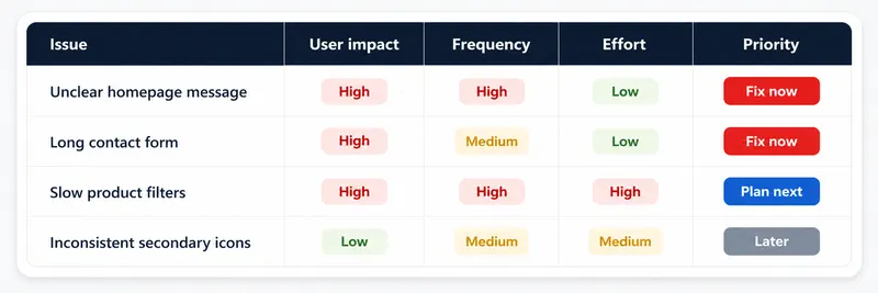
Score each issue using three questions:
1. How many users encounter it?
A confusing homepage message affects more people than an awkward setting buried deep in an account area.
2. How badly does it block progress?
A slightly unclear icon is less urgent than a checkout flow that fails without explaining why.
3. How difficult is it to fix?
Changing CTA copy might take minutes.
Redesigning onboarding could take weeks.
A simple prioritization can look like this:
This is where a UX audit becomes useful.
Instead of redesigning because the website "feels old," you start fixing the problems that genuinely make it harder for users to move forward.
A UX Audit Should Not Automatically Lead to a Redesign
This is important.
Sometimes a full redesign is justified. If navigation, content structure, mobile UX, visual hierarchy, and the underlying platform are all working against the business, rebuilding may be more sensible than applying endless patches.
But many websites do not need that.
They may simply need:
a clearer headline;
fewer CTAs;
a shorter form;
better mobile spacing;
stronger trust signals;
faster interactions;
clearer errors.
A good audit should help you distinguish between the two.
At BluDeskSoft, our UI/UX Design Services start with the existing user journey and friction points before moving into wireframes or visual redesign.
The goal is not to make an interface look different for the sake of it.
The goal is to make the product easier to understand and easier to use.
Final UX Audit Checklist
Run through these 15 questions on your own website:
If several boxes remain unchecked, do not immediately redesign the whole website.
Start with the friction closest to the conversion.
Fix it.
Measure what changes.
Then move to the next one.
Want a Second Pair of Eyes on Your UX?
It is difficult to audit a website you see every day.
You already know where everything is. You understand the terminology. You know which button leads where.
We can review the user journey, identify the highest-impact friction points, and help you decide whether you need a few focused improvements or a larger UX redesign.
Sometimes the difference between a visitor leaving and becoming a customer is not a completely new website.
It is removing the one thing that made them hesitate.
A practical accessibility checklist for small business owners.
 BluDeskSoft
-1-1600x900.webp)